Lab 1 Semester 2
- Alexandra Charland
- Jan 23, 2021
- 3 min read
In order to design more intuitive user experiences, the WWDC has outlined these 5 elements:
Platform Savvy
An app that is platform savvy desires to imitate actions that users have experienced using apps on their current platforms, which were originally implemented to mimic actions a user might take for that task. For example, iOS apps feature swiping left to delete an item on a table view to mimic a person crossing off that item on a physical list. An example of an app that does this well is myHomework. To use this app, I just add a homework assignment associated with a class and due date and it is automatically sorted into a table view by due date. When I finish an assignment, I can swipe right to cross it off and complete it, or I can delete it by swiping left.


Swipe left or right on an assignment in a table view on myHomework
Easy to navigate
Apps can employ tab bars and progressive disclosure with back buttons to make navigating the app easier. An example of an app that features both tab bars and progressive disclosure is Duolingo. A selected tab bar icon is colored in fully so that the user knows they are currently viewing that page, and the language learning process is progressive to give the user more focus on a certain task instead of having the view being scrollable, which would give off the sense of an exam.


Tab bar icons in Duolingo are recolored based on selection

Language learning with progressive disclosure instead of scrolling
Clear
The words and icons used to convey choices can make it easier for the user to understand the kind of effects each option would grant. The app GlobeConvert makes it easier for users to perform unit conversions by allowing them to choose a measurement unit from a list of categories given in both words and icons. The possible units to convert between change depending on the category, which contain both simple units for a casual user and more complex units for scientists and engineers.

Categories in GlobeConvert are indicated with both icons and descriptions


GlobeConvert contains a variety of units for both regular people and scientists to use
Simple
Having too many features displayed at once may overwhelm a user who intends to use one function of the app, therefore for the best results it is best to follow the 80/20 rule: display 20% of the features to the user (usually the main feature) and hide 80% of the other features that the user will not use immediately, such as more detailed settings. An app that does this well is Transit. Its main features are to either get directions to a destination or to view the transit options nearby and their estimated time until arrival. All the other settings and features are hidden in the settings button.

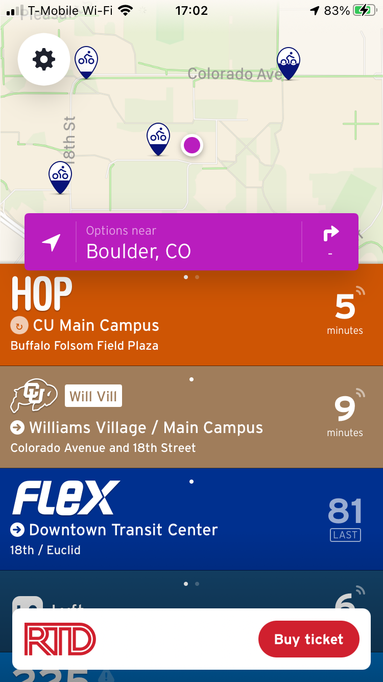
Main features of Transit are getting directions or viewing arrival times of nearby transit options

A full list of settings and other features for Transit can be found through the settings (gear) icon
Focused
The user expects an app to fulfill a singular purpose, so it is best to keep the app's features geared towards this purpose to avoid cluttered features. An example of a focused app is Piazza, which made an app reduced to only the forum feature of viewing, posting, and answering questions instead of all the features found on the original website.


The singular purpose of the Piazza app is to access the forum feature
Comments