Lab 2: 11 Design Principles
- Alexandra Charland
- Sep 14, 2020
- 4 min read
The elements of design can be broken down into 11 distinct principles. Following these principles will improve an app's usability and the usability of anything that requires human interaction.
Principle 1: Wayfinding
Whether an application has many features or just one, it is important that people are able to know where they are, where they've been, and where they can go. Menu bars with labels, page descriptions, and navigation arrows are examples of some important features to help people move around.
Principle 2: Feedback
What does a button do when pressed? How do you know if it did something? Brief indicators such as sound effects, message balloons, and animations allow someone to see what they are doing and what they have done, and possibly what they should avoid in order to reach a desired outcome.
Principle 3: Visibility
Seeing is believing, and what you can't see may not cross your mind. An application's important features should be displayed where someone can see it so they can get the most out of it.
Principle 4: Consistency
Using symbols that most people are familiar with means less learning and less confusion. Keeping a theme going with layout and colors gives structure and professionalism along with style.
Principle 5: Mental Model
Swipe left to go right, tap to pay, shake to shuffle, and other small gestures like these are ingrained into our minds from past experiences. Changes to these common functions will leave someone wondering whether the application is crazy, or whether they're crazy.
Principle 6: Proximity
Pulling a lamp's string turns on that lamp, not the one across the room. Similarly, pressing play on a video plays that video, not the next video.
Principle 7: Grouping
Apples are to apple trees as social media icons are to share buttons.
Principle 8: Mapping
Sliders for scales, knobs for degrees, and switches for binary are all controls designed to model the objects they affect.
Principle 9: Affordance
How do you know what something does? Can't you tell by just looking? Pick it up, turn it on, throw it, whatever makes sense to you. You probably shouldn't eat it though.
Principle 10: Progressive Disclosure
A lofty goal seems daunting to do all at once. But every mountain started as a stone. Break up large tasks into smaller tasks to tackle one by one, and something complex becomes more simple.
Principle 11: Symmetry
Symmetry means balance, and balance is key for structure and order. Maintaining visual balance through reflective, rotational, and translational symmetry gives structure to information, and it's pleasing to the eyes.
Example Applications
Contacts
The built-in contacts application provides symmetry, grouping, proximity, and wayfinding. Perhaps because this is an Apple original application, the app would be designed to maximize the relevant design principles. The app displays translational symmetry with the list of all the contacts, and good alphabetical grouping with a side scroller that can take me to the letter I need. The app provides good proximity by providing links to other applications that I could use with a contact, such as links to iMessages, Phone, and FaceTime. Finally, the app implements wayfinding with a back arrow to the contacts list at the top of the screen, which is easy to find and clearly conveys where it leads.


Soundcloud
Soundcloud provides visibility, consistency, and feedback (scrolling music boxes). All the functions are displayed as symbols at the bottom of the screen, and I can easily switch between them while playing music. The app has a consistent theme with side-scrolling music album photos and displays the common media progress bar while music is playing. The side-scrolling music albums offer feedback in the form of hiding part of the last album as an indicator that I can scroll for more.

The app falls short in grouping. The list of hot albums on the home screen could be sorted alphabetically by genre, and therefore grouped better, however perhaps this design was done on purpose so that I would be forced to scroll through all the media to find what I want.

Hours
Hours provides symmetry, feedback, and visibility. The symmetry is translational in the way it displays the different timers in a list order. The app provides good feedback in timing mode, where you can see the timer running after pressing a clock and the colored bar at the top keeping track of the amount of time passing by. The main functions of the app are apparent on the home page, and this app will function without calibrating all the other features in the settings menu.

This app falls short in consistency, however, due to some features being implemented incorrectly (the side-to-side page scrolling with dots for the color select is implemented in the wrong direction, for which you scroll left instead of right to view the next set of colors), some symbols being used more than once for different categories, and an inconsistent color scheme.


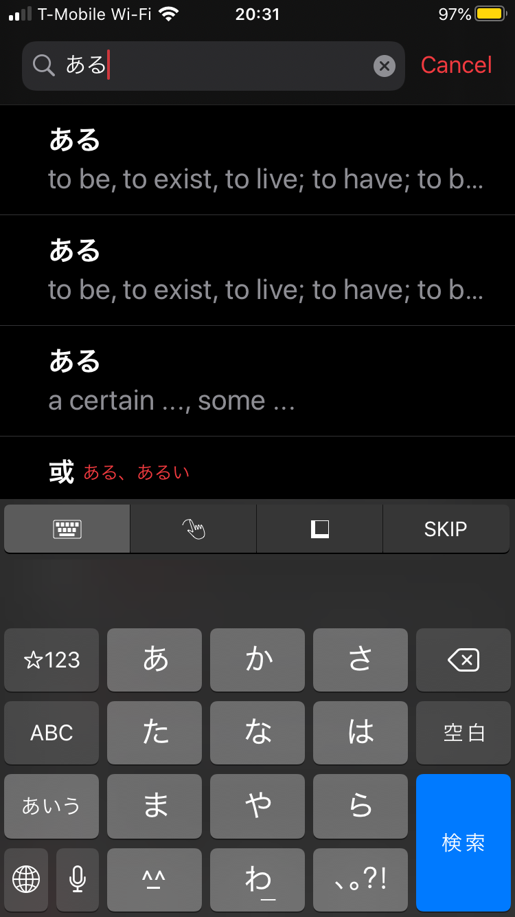
Japanese
Japanese provides visibility, affordance, consistency, and wayfinding. The necessary functions of this dictionary app are all displayed at the bottom of the screen, giving it good visibility. The words on the search page scroll across the screen, and each word has the affordance of viewing a word's definition by tapping on it. The layout for all the words in the search results are consistent in which one can expect to see related results and a definition page with the same amount of information.


Finally, the app allows easy navigation between each page with back buttons and gives good indicators for what to do next, such as pulling up the keyboard after viewing a word and navigating back to the search screen.
Comments